Over the course of 4 weeks, remotely, my team and I researched and designed an intimate but not awkward online bra fitting experience for Chicago based start-up Bratadah.
Bratadah is a Chicago based start-up, their main mission is to connect online bra shoppers direct to small boutique brands as well as brand name manufacturers by recommending the perfect fit across multiple brands and styles with their proprietary Perfect Fit algorithm.
By connecting customers directly to manufacturers, Bratadah guarantees competitive prices and eliminates the need to keep physical inventory by drop shipping straight from the manufacturer.
Bratadah came to us in the early stages of their growth. Our job was to re-design the existing bra fit experience from a series of dropdown selections to something more elegant and engaging for the customer.
Getting to know our client, the users and identifying the problem space through various research methods.


During the kickoff meeting we got to know our client and her customers experience by walking with her through a journey map workshop. This helped us understand her expectations of the shop to purchase experience she strives to achieve.

How might we alleviate the awkwardness and overwhelming experience users often endure during the bra shopping process and help them feel confident in their choice of fit, style, and comfort in their online bra purchases?
...
Align on a visual language and tone of voice that speaks to users to build transparency and confidence in trust and fit.
Designing clean, clear, and intuitive user flows to reduce choice paralysis.
Creating an easy, convenient, informative space that is inclusive of each customers’ experience, preference, and choice.
- After two rounds of 6-8-5 sketching, we had over 40 ideas that were more features than whole concepts. Our next step was to think outside the ideation box and do what felt was going to get us closer to whole concepts.
- We each picked features that we liked and sketched a final concept that was presented to the group and voted on our top 3.
- 3 Mid-fidelity prototypes were designed and we jumped into remote testing, 2-person teams presented 3 concepts in sequence to 7 new users located in Seattle, Chicago and North Carolina. We watched the users move through the prototypes and followed each individual test with a Q&A and de-brief.


Having some fun with the Bratadah name this concept ties in the idea of cards in a deck and a playful tone of voice to create a magical journey through the bra fit process.
Appeal: To the point, familiar system, questions made sense
Challenge: The function of the deck was unclear, CTA clarity, users wanted more introduction
Opportunity: Visuals always on display, clarify recommendation deck, offer more explanation

Using hover effects and the body as navigation. This concept allows the user to hover and click into points of the bra journey to answer the questions.
Appeal: Organization of questions, users enjoyed the visuals, felt methodical
Challenge: Pop up was a disconnect, click fatigue, needs more instruction and guidance
Opportunity: fun reveal of results, more personalization, a better way to explain the "Why"

Echoing our design principle of “Sleek & Simple” this concept design and user flow stays close to the client's needs. The sidebar allows the user to see their answers as the main window scrolls to progress into deeper details within a question.
Appeal: Personalization, sidebar progression, natural language processing - felt conversational, progressive visual fit range
Challenge: Initial scrolling, more info on the "Why"
Opportunity: Visual queue to scroll, adjust scrolling breakpoints, apply sidebar information to "Recommendations page"
Users: "It feels like going into a small boutique and being fitted by a human and not a robot" - Alaina
Client: Concept C aligned the closest with the clients vision. The design was a feasible for us to hand off to the client and developers, eliminating any complicated designs. Listening to user feedback she trusted our suggestion of moving forward with Concept C

Based on user feedback we made some tweaks and changes in the form of UI additions and added content before our last round of testing.
A simple change of adding the Bratadah logo to introduce the brand and establish a connection with the user.
There are quite a few uncertainties in bra fitting that we wanted to provide answers for without crowding the experience with text. A drawer was added to the sidebar that provides instruction on fit and teaching moments for things like the value proposition of the product.
The original questions only covered bra style, age, band size/fit, and cup size/fit. Users had a lot to say about other key factors that we felt were important which are support and those pesky straps.


Back with our 2-person remote testing teams, testing 6 returning users. We asked the users to use the “Think Out Loud” method while going through the prototype. We observed their experience and followed up with a Q&A and de-brief.
VIEW PROTOTYPE
Task: Complete the fit experience
Feedback: Recommendations page
Metrics: Ease of use 4.6 / Satisfaction of length 5 / Overall experience 4.3
Net Promoter Score: 1 Promoter, 5 Passives and 0 Detractors
A request from our client, she wanted to know if users preferred to see the manufactures sizing to trust to purchase? We tested two product page layouts with users to understand if manufacturing sizing is important to see knowing that sizing between manufactures differs greatly. In the end, users leaned in the direction of comfort in seeing the sizing even if they know it could be different from what they usually buy.

In our final sprint of this project our client had requested to see what this might look like on mobile. We provided her with a series of wireframes representing the 5 main screen types.
...
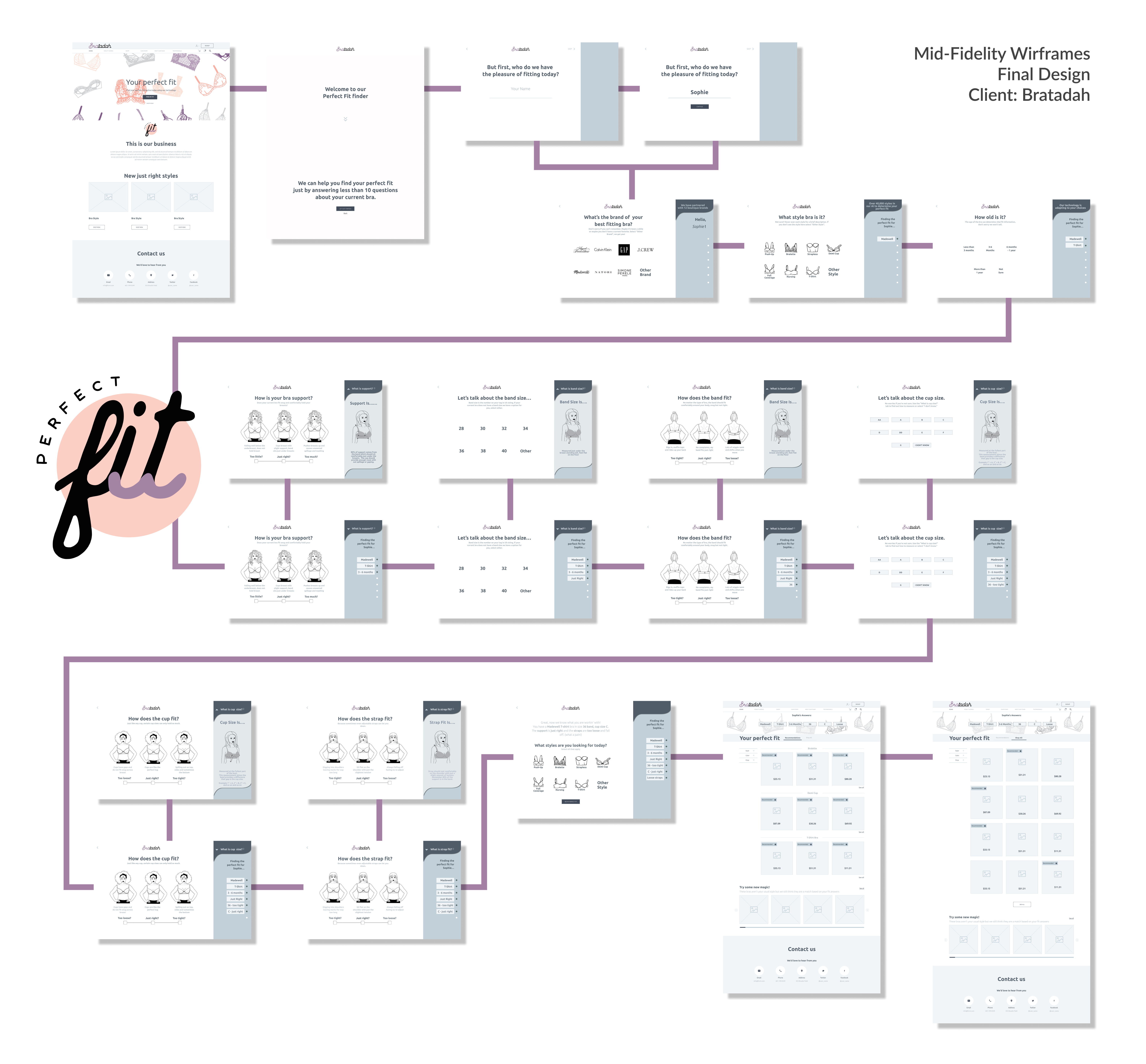


In then final mid-fidelity design a short intro as added to explain to the user what they are about to experience broken down into three steps Build, Explore and Track.
In the Build section users expressed the preference to see their choices in one view. To fix this the horizontal menus in the Build section were changed to a series of drop down menus.
Based off of information from user testing in the customization section an "Add All" toggle was added as well as some copy to guide the user through the experience.
Circling back to our first meeting with our client and the journey map workshop we did with her. We re-visited the journey map artifact and updated it with the information we gathered from our user interviews and testing.
In the end we handed off to our client a mid-fidelity bra fit experience and mobile mockups. As well as a list of next steps and future recommendations from the information we gathered from our users.
NEXT STEPS
- Help Chat: Including a chat option, either AI or personnel, could assist users with fit questions and increase retention through the process
- Material And Texture: On the item page, including details regarding material, texture, and feel will increase users’ confidence in their purchasing decisions. In particular, strap length, adjustability, and width.
- Profile: Users expressed excitement at the notion of having the ability to save their fit through a profile or cookies
- Testimonials: Adding testimonials reviewing the fit of bras recommended by the algorithm would increase user confidence. Dividing these testimonials by body type would further bolster users’ trust.
- Why This Bra: Briefly explaining why a bra was recommended on the product page will inspire the confidence to purchase within users.
FUTURE RECOMENDATIONS
- Add More Brands To “Current Bra” Questions: “Where is Victoria’s Secret?” Users hoped to see more brands in the first question of the fitting process as there are only 7 brands currently listed.
- Representative Models: Users asked if it would be possible to see product photos of models with different body types based on size selection and fit process so that they could see how a product would fit someone their size.
- Expand Algorithm Questions: Bring back in some questions/data points into the algorithm and allowing users the option to go more in-depth with their fit would delight users who have less traditional sizing
- Strong Return Policy: The single most common request when asked what would increase purchase confidence is for a robust return policy
- User Categories: Users requested to be sorted into categories based on their fit that would show them what purchases similar users made and liked.
This project was a practice in restraint. We had the ambitions to think way outside of the box and design a bra fit experience users have never seen before. As we got to know our users and the client more we realized that it was important to handoff a design that was simple enough for our client to manage with developers . While also not bombarding our users with learning a new system in an already overwhelming and confusing process as bra shopping.
This project taught me that sometimes it's ok to change up some of the traditional methodologies. Some projects will need more flexibility to get the ideas out. During ideation we got stuck on developing full concepts. After a little convincing I was able to get my members of my team to try a different approach in the ideation phase that move us forward with three concepts we were excited about.

